Monday, 22 October 2012

Album cover analysis

The main conventions of album covers are to feature the artist or an image that can be associated with the band. The text on covers will be the album name and artist name. Usually the typography will be a font that has been used several times for the artist so that the font will be associated with the artist.


Both these album covers feature the artist. The Script's album cover follows convention by having the three members on the front, with two of them photoshopped so that they are on top on the lead singers image. This tells the audience who the lead is without hearing or knowing about the band. It also gives a feeling of togetherness to the band. The font used for 'The Script' has become a feature of the band, as the font has been used on previous albums and promotional material. This helps people to identify it easily with the band. The desaturation of colour and simple colour scheme gives the album a more sophisticated feel to it.  
Like the Scripts's album cover, the Ed Sheeran cover also features the artist on the cover. This is a good promotional move for the record label, as this is his first mainstream album. His image takes up the entire cover so that it is the only thing you see. This helps to get him recognised with the public. Unconventionally, the artist's name isn't featured on the cover, which for a relatively new artist isn't often done. The album name '+' is on the cover, very small in the corner. The use of the colour orange has become a trademark for Ed Sheeran, so using it on this album helps to promote this idea that orange is his colour. 

Friday, 19 October 2012

Magazine adverts for music

As well as a digipak, we are also making a magazine advert for it. Digipak adverts are mostly advertised in music magazines such as Kerrang! and NME, but can also be seen advertised on TV and a number of websites online. Youtube is one of these and is an example of media 2.0, as the audience generally has to go searching for it, much like a movie trailer. As well as this they will also be advertised before watching videos on Youtube. The digipak will also be advertised on the bands website to let the fans know when it will be released.

They are a useful tool for record companies to get their artists' recognised and their music and to get people to go and buy the album.  Like the Lana Del Ray one, they usually show the album cover with artist name and album title with a release date on top. There can also be quotes from magazines that have reviewed it to hype up the album.

Thursday, 18 October 2012

Digipaks

These are some examples of the standard digipak. All digipaks will accommodate for the CD(s). Features of digipaks include a track listing of the songs on the album and a message from the artist to the fans thanking certain people. There will be a general thanks to all the producers, writers etc involved on one of the sides. Images of the artist will also appear not only of the front, but sometimes in the some of the other pages to make it more visual than just text. For albums that don't feature the artist on the front other symbolic images will be used that relate to the artist or album. 

The digipak above is how a lot of them are displayed, with it folding out to the sides. They have made the artist name stand out with the typography they have used and by putting bright colours on a dark background, creating contrast. The colour scheme matches on all sides so that they all link together. The image on the disk has also been used on one of the sides of the digipak.

The digipak below uses a different folding technique that isn't used on a lot of digipaks. This helps give it an appeal, because of the different style. They have featured each band member on each side that opens out. There is a lot less text on this one from what we can see, but there will probably be something on the back. Again, the use of bright colours on the artists pictures and the CD means that they stand out from the black background.


For our digipak we are thinking about doing the traditional style that is used in the top digipak. We will have the CD in the middle with a track listing on the side that is the back when folded. We will probably stick to convention and have information about the people involved and a message from the artist. 

Thursday, 11 October 2012

Ancillary Products

For our two ancillary products we have decided to do a digi-pack and a magazine advert for the song and artist. Digi-paks usually have the CD and images of the artist, a track listing and 'thank-you's' to the people involved. These days digi-paks can also come as a free download with an album from iTunes, because people aren't buying as many physical CDs as they used to. 

 Typical digi-pak - this is for Oasis. They usually come in this form (six sides), with the CD inside. Interestingly this doesn't have the band on the front, but if this album was made after they had established themselves, then it is more likely for bands to do this.


To get people to buy the digi-pak it has to be promoted. It used to be that they would be advertised in magazines and newspapers, but now as well as this, they are also advertised online. We are going to produce a magazine advert for the digi-pak. A digi-pak advert would most commonly be seen in a music magazine like Kerrang! or NME. 

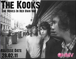
 Magazine advert for The Kooks (indie). Shows the whole band unlike the Oasis digi-pak to get the band recognition as they are not as big a band as Oasis.

Wednesday, 10 October 2012

Thoughts after test shots and animation

Despite the animation we did turning out well, we decided that it didn't fit with the genre the song is in, so we have decided to revisit a previous idea we had which was mainly based on performance. The new idea is to have the artist at an outside location and film him playing the song and also some narrative shots of the artist walking outside. We have decided on a rural location.

Changing the concept has meant we have had to redo the storyboard and relook at how the narrative and performance will work together. We felt that this idea would fit better for the song and the genre and is something a bit more conventional for the genre. We plan to film within the next two weeks.

Friday, 5 October 2012

Our Animation

This is our first go at using stop frame animation for our music video. Although we are really pleased with the results, we've decided that for the song we are using, animation doesn't create the right atmosphere. The song we are using has a more negative feel to it and the artist is keen to have that atmosphere for the video. 

Despite this, we are glad that we tested it out and is something that we have experimented with. This is definitely something to consider for future projects now that we know how it works.

In terms of where we go now, we have gone back to an early idea that we had of doing  mainly performance based video with cutaways to narrative. At the moment we are thinking of the artist in an outdoor, rural location.

Animation Update

As we were unable to acquire the lecture theatre for the whole day, we have had to change the location where we will film the animation. We now have two other options, both of which shouldn't come with any problems so the filming is still going to go ahead on Friday. We will be filming for the whole day so that the animation looks consistent. 

Test Film of Jack

Test shot video


These are some test shots we took today of our artist, Jack Simmons. We will probably film him in most of these shots when we come to film the real thing, as well as a long shot so that the animation can go on behind him as shown in the storyboard. This was just to get an idea of what it would look like. 

We hope to film the animation next week and then Jack the week after.

Testing Animation

Now we have decided to use animation we spent an hour testing out how it would work and talking out the sequence. We are definitely using post-its to do our animation and we have decided to use them to create images that reflect lyrics of the song. We will be showing them on a wall behind Jack, but we have also decided that we don't want Jack to be animated, because of the issue of lip-syncing. Therefore, we have decided to record him separately playing the song the whole way through in different shots, (ms,cu,ls) on a blue screen then doing the animation separately, again on a blue screen, then layering them in edit. That way it will look like the animation is happening on a wall behind him, but he will still be live action.

We have tested out animation using post-its on a fairly small space and now know that when we actually come to film it we will need a big floor space for the animation, because of the size of the post-its and the shapes that we want to make. So now we have to find a space, (which will probably the lecture theatre) where we can set up and film our animation. Hopefully, we will be able to get the room for an entire day so that we can do it all at the same time, so it all looks consistent and the post-its don't get moved.

The post-its will be done on the floor on some blue card (instead of blue screen, because it needs to be completely flat to work properly), as we feel that this is probably the easiest way to do this. Therefore, we need to get the camera up high, which hopefully won't be too difficult to do as we think we can get a tripod that will reach the height we need.

One of the next things we need to do is work out timings for each image and how long we need them to last in order for them to appear in the right part of the song. 

This is a tester we did:
From this we now know that when it comes to filming the actual animation parts, we will have to do it on a much bigger scale, because of the size of the post-it notes. For the tester we worked with two frames for each image and we think that this is the speed we need for the animation. Apart from this, we are fairly happy that the animation won't be too difficult to do once we figure out what colour post-its we want for each image and how the images will flow into one another. We may have to do a few more test shots before the filming of the actual animation just so we can work these things out properly.

Thursday, 4 October 2012

Storyboard

This is our storyboard for our music video. Animation is going to be used for a majority of the video, and so will be one long continuous shot as the animation happens behind Jack. There will be long, medium and close up shots too of Jack so that the artist becomes recognisable. From a label's point of view this is one of the most important things because it gets the artist recognition, therefore makes this a convention of most music videos across genres. 


What we want to do with animation

The animation we are going to do is obviously going to be on a much smaller scale than the Coldplay video. We researched more videos using this style, but on a smaller scale.
This one uses mainly Skittles, but also writing and drawing. This is the kind of thing we are thinking about doing. We have had the idea of using newspaper letters to create words or maybe doing drawings like in this video. 

One of the videos we were shown was using post-it notes. We thought this could be a good thing to use, because they are cheap to buy and you can easily buy them in bulk at a cheap price. We researched further into what we could do by using these for the animation. 
http://www.youtube.com/watch?v=-ZtxHOfmhH4
From seeing this, the idea we are thinking about at the moment is using post-its to create our animation, by creating images on a blank wall, much like it has been done here. The images would be references to the song and illustrate the lyrics. 

This is another stop animation video we found that we thought was really effective:


http://www.youtube.com/watch?v=mOQJEcHDKGc&feature=related

Stop Motion Animation


We recently had a lesson on how to do stop motion animation in case it was something that we would be interested in. This video we watched is by a South American artist:


After having a lesson on animation, we have decided to consider it for our music video. It has been used in music videos before, close to our genre, for example Coldplay - Every Teardrop Is A Waterfall. The music video uses a stop motion technique and was directed by Mat Whitecross. They use drawings/painting as their medium like the BLU street art and done a mixture of lyrics and images. 

Although the use of animation may not be a typical convention, the video still uses conventions of music videos by having band performance and having shots of them individually and all together. Throughout the video the focus is mainly on the band. Chris Martin is still lip syncing to the camera, which is a typical convention, even though it is animated. They also have their unique designs on their instruments, which has become an icon of the band, especially since this album, Mylo Xyloto came out in 2011.


The performance in this video has two parts; firstly, with the use of stop motion and secondly, with the use of slow motion techniques as well as strobe lighting and vibrant  colours.
We think it could be something different that we could add to our video as not a lot of music videos use stop motion. 

Obviously the Coldplay one is an example of animation being used a a large scale. Also they have decided to use stop motion animation when Chris Martin is singing which is incredibly hard, because of getting the lip syncing right. For us it would probably be better for us to keep the animation separate from the performance, because that will take a lot of time for us to get right a number of test shots. 

Final Song Choice

We decided to go with the second song, 'One Side Of The Story', as we found it a lot easier to come up with ideas for the video and the narrative. The song is in a similar genre, but we think it would now classed and indie rock, however, this does have cross overs with rock and soft rock, so the conventions for music videos are mainly the same. The two videos I analysed in the genre were sometimes referred to as soft rock and other times as indie, so the genres do contain a lot of the same elements.

The next step is to develop our ideas and feedback to the artist. We know that we would like to do a video with both narrative and performance of some kind. As the genre is indie rock, we are not going to try and come up with a massively complicated idea, because it isn't really a convention for music videos of this genre. 

Second song choice (lyrics)

 One Side Of The Story
    Jack Simmons

Verse 1:


Can you hear the whispers? Rumours multiplying,
Everybody’s Talking, Behind your back,
But you only know one thing and thats that you're not alone,
I'm sure Hundreds have been through this
before.

Chorus:
But you only know one side of the story
I know you don't know which direction to take
But you only hear the wrong side of the story
still you judge, you make up your mind.
 
Verse 2:
        This is the worst place to be right now

       Your misery feeds their souls
       You have to just keep you head above ground
     Ignore whatever they say

Chorus
Verse 3:
  Two faced, loose tongues full of lies
 I Hope you are one of a kind
  you really stretch me you can get in my mind
      All I know is karma will get you in time
  Chorus

    Interlude
    
    Chorus (end)

Now you wish you knew both side of the story.

Analysis:
  • Written in second person as well as first, unlike the first one, which was more just about him.
  • Its quite an easy thing to relate to for the majority, which helps to develop a singer/listener relationship (especially with the question at the beginning, it sounds like he is addressing them) and can establish a fan base.
  • Negative syntax throughout, matching genre of soft rock.
  • Slightly unconventional lyrics/meaning, because it doesn’t reference love which a lot of soft rock songs do.
  • The song itself is at the moment an acoustic song, so the video shouldn’t be made too complicated with a fast pace narrative for example, to match the tone of the song.
  • It follows conventions by telling a story which a lot of songs in this genre do.
  • I think that it is easier to think of imagery for this song than the first one, so it might be easier to come up with a concept.

Monday, 1 October 2012

Target Audience

Our target audience is people of our age - about 16+. We chose this audience because we found that a lot of people our age are currently listening to new artists like Ed Sheeran and Ben Howard, which is quite like our artist. It is also young people that are more likely to listen to new artists before they have been fully established, because they are also the target audience for a lot of music magazines and they are more likely to go to their gigs, because they are cheaper than established bands playing in big venues. 

For example, Benjamin Francis Leftwhich has currently been doing local shows in Oxford and Birmingham which a lot of people my age that I know have been to. He's currently the new artist that everyone loves and is talking about. When asking some older adults who he was, most of them didn't know. They also said that they don't go to many, if any, gigs anymore or read music magazines, so they don't hear about small, new artists.